I want to discuss whether it could make sense to enhance readability of models by improving the way message flows (and data associations?) are displayed.
A typical visual problem with message flows in bigger analytical conversation diagrams is that they visually “cross” symbols they have nothing to do with. One actually just wants to connect the flow with a symbol - but this symbol unfortunately happens to be visually “behind” a few other symbols. See:
In order to make diagrams neat again, some tedious rework can become necessary - and this tedious rework tends to become necessary over and over again. Therefore I am thinking about a way to display message flows in a way that would allow modelers to better live with the default visual layout. I am searching for ideas.
One idea I already have is the following: display message flows visually “beneath” other symbols and labels, but make those other symbols and labels slightly transparent - just enough transparence that one can see that there is a line going through behind a symbol (or label). This would allow to focus on that line and not loose track of it when following it visually, but would also allow to focus on the unaffected symbols without being disturbed by message flows going through it and without neagtive effects on the readability of crossed labels.
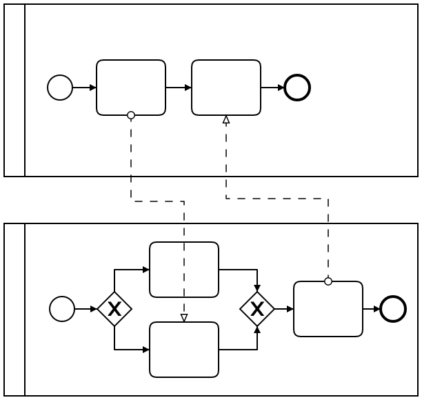
We have the same instance of the problem for sequence flows, too and we actively decided to keep the visuals that way:
The reason is that it could otherwise confuse users in seeing things that are actually not on the diagram. Imagine for instance what it would look like if the sequence flow was behind the first task.
If we want to fix this we must fix both instances of the problem in a reasonable way. Something we do not want to end up with is trading more room for confusion with a bit of modeling convenience.
Hi @nikku - the issue is not so much about modeling convenience actually, much more about less confusion for the reader of a process model. Let me try to explain why we don’t have to “trade” anything in my mind. As a result of getting this issue “right” I am convinced we would have less confusion - and quite a bit more modeling convenience - as a “side effect” if you want so.
First of all: I agree that it seems to be the same instance of the problem for sequence flows - but it actually isn’t from a user’s perspective. I see a significant difference when it comes to message flows. So I agree 100% for sequence flows: sequence flows should always be displayed. In case sequence flows run through another symbol, the user has to get it right visually and rearrange those flows. (Why? Semantically sequence flows represent process execution from a participant’s perspective. The sequence flows shown within a pool must be understood as a whole to understand those process execution semantics. Encouraging modelers to have sequence flows visually crossing other symbols would definitely confuse the reader a lot!). So: let’s just settle this part of the discussion!
But on the other hand message flows represent a sort of “point-to-point” interaction between several participants: as a reader of a BPMN collaboration diagram I actually just have to understand which “points” of a participant’s process interact with which other “points” of another participant’s process. To visualize this, a message flow is drawn. However, for somewhat bigger collaborations, those message flows start now to wildly cross through other (unaffected) symbols and eventually whole (unaffected) participant’s pools. I just want to show that one point inside pool A at the top of the diagram is connected with some other point in pool C at the bottom of the diagram. A straight message flow crosses through unaffected pool B in the middle of the diagram and eventually a lot of unaffected symbols within pools A, B and C.
Therefore: by connecting those points and crossing symbols (and even whole pools) message flows confuse the reader trying to focus on what’s normally most important: understanding the execution semantics represented by sequence flows. Therefore today we often draw message flows with many corners just to “circumvent” symbols and pools in order to avoid confusion for the reader when focusing on sequence flows. This is inconvenient but doable. But what is the effect? When the reader now wants to focus on interaction of participants and reads a message flow, s/he just must be able to see as easily as possible which points are connected with each other. But the additional corners also make the message flows more confusing to interpret correctly! The straighter the interacting points are connected the easier the message flows would be to read!
This is something no modeling tool got really “right” so far - in my mind. Therefore I’d be thrilled to see the issue solved for the first time in BPMN history. - even though it’s just a clear “nice to have” - sure!
By reducing the visual presence of message flows when crossing unaffected symbols (flow objects, whole participants) we would 1) cause less confusion for readers when focusing on process execution semantics, we would 2) cause less confusion for readers when focusing on participant’s interaction semantics and we 3) would increase the modeling convenience by encouraging analysts to leave message flows in many cases just where they are by default.
Many thanks for these thoughts and suggestions. Maybe others have suggestions too? I myself will need to sleep a few nights to better sort out my gut feelings with respect to all of that.